
The mathematical link between over-policing and COVID under-testing
A frequently cited COVID metric is the positivity rate: that is, the fraction of COVID tests that come back positive. A low positivity rate suggests that an area has enough testing to properly monitor its outbreak; a high positivity rate suggests under-testing. The WHO suggests a 5% positivity rate as a threshold for reopening: ie, only 1 test out of 20 should come back positive.
Because there are huge racial disparities in COVID impacts, public health experts and the federal government have also recommended breaking down the positivity rate by race. This data still isn’t systematically available on a national level as far as I can tell: I wrote to The New York Times and the COVID Tracking Project, and neither of them had data across all states. The COVID Tracking Project data did, however, have data from 6 states, and I plot this below. They break down the data by race and ethnicity separately, which is why I compare Black to white (left plot) and Hispanic to non-Hispanic (right plot). The Black positivity rate is higher in all states than the white positivity rate; similarly, the Hispanic positivity rate is higher in all states than the non-Hispanic positivity rate, suggesting under-testing of Black and Hispanic populations.
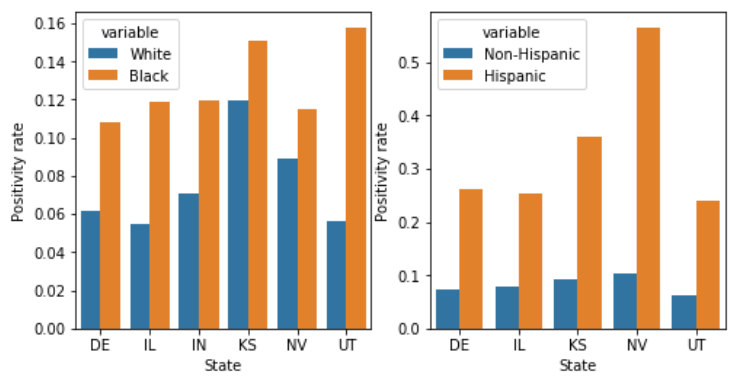
Take this graph with a grain of salt; there’s a lot of missing data, and the positivity rate for Hispanics in Indiana is higher than I think it should be from the Indiana website, possibly indicating an error in the COVID Tracking data (that’s why I omit Indiana from the ethnicity plot; I reached out to the COVID Tracking project about this and will update the post if they reply.) Still, the pattern of disparities fits with previous work showing higher positivity rates among Black and Hispanic children in DC compared to white children; higher positivity rates among Latinos in Baltimore and DC; and higher positivity rates in New York, Philadelphia, and Chicago zipcodes with larger minority populations. All in all, the data here may not be great - lots of missing states, lots of missing race/ethnicity data even in states that track it - but nonetheless shows very consistently that Black and Hispanic populations have higher positivity rates. This is not some abstract statistical quibble - if minorities are being tested only when they’re far more likely to be sick, they may go untreated and get worse care; they may also spread COVID to more people. Both of these are consistent with the higher per-capita numbers of deaths and cases for Black and Hispanic communities.
Breaking down the positivity rate by race is a familiar trick to people who have studied police searches. In studying policing, we call the positivity rate the “hit rate”, and define it as the fraction of police searches that find contraband (as opposed to the fraction of COVID tests that find COVID). In policing, as in COVID, we worry if we see large racial differences in the positivity rate. If police searches of white drivers find contraband 90% of the time, but searches of Black drivers find contraband only 10% of the time, it suggests that the police are searching white drivers only when they’re very likely to be carrying contraband, but searching Black drivers at a lower threshold of evidence. Similarly, if COVID tests of Black patients find COVID 90% of the time, but COVID tests of white patients find COVID only 10% of the time, it suggests that we are testing Black patients only when they are much more likely to have COVID, potentially indicating under-testing. (Note that the skews we typically observe go in opposite directions in policing and COVID - in policing, whites tend to have higher positivity rates and face higher thresholds for searches, and in COVID, whites tend to have lower positivity rates and face lower thresholds for tests).
But the policing literature also suggests a problem with just looking at the positivity rate, called infra-marginality. I think this paper explains infra-marginality pretty clearly, so I’ll adapt their example to explain it. Imagine that there are two races - white and Black - and within each race there are two groups - one who is very unlikely to have COVID, and one who is quite likely. Imagine these groups are easy to tell apart - one is showing COVID symptoms, for example. Each race and each group has the following probabilities of having COVID:
| White patients | Black patients | |
| Not showing symptoms | 5% have COVID | 5% have COVID |
| Showing symptoms | 50% have COVID | 75% have COVID |
Imagine that there is no racial bias in whom we test: we test everyone who is more than 10% likely to have COVID, regardless of race; we apply the same probability threshold to both races. Then we will test everyone in the “showing symptoms” group, and end up with a positivity rate of 50% for white patients and 75% for Black patients. We will incorrectly conclude from the higher positivity rate among Black patients that they are being under-tested relative to whites - that is, tested only when they are more likely to have COVID. But in fact, in this hypothetical, everyone faces the same 10% testing threshold.
We reach this misleading conclusion because the statistic we’re measuring - the positivity rate - is not the same as the threshold at which we’re testing people. This threshold is hard to measure - it’s not a simple fraction directly observable from the data, the way the positivity rate is. But previous policing work has developed a “threshold test” which, as the name suggests, attempts to infer this threshold. It deals with the problem of infra-marginality by allowing each race and location to have a different distribution of risks – eg, allowing some races or counties to have lower risks of getting infected – in other words, explicitly modeling the sort of hypothetical scenario described above. A complete description of this test is beyond the scope of this post; see here for the original test, here for the faster version, and this footnote [1] for some subtleties in how I adapted it to work on COVID data. For our purposes, it’s enough to know that the test uses three pieces of information to infer the thresholds and risk distributions for each race group in each county (or other small area): the population, the number of COVID tests performed, and the number which came back positive. So a single row in the data might look like “In Alameda County, there were 200 tests of white people, and 30 came back positive”.
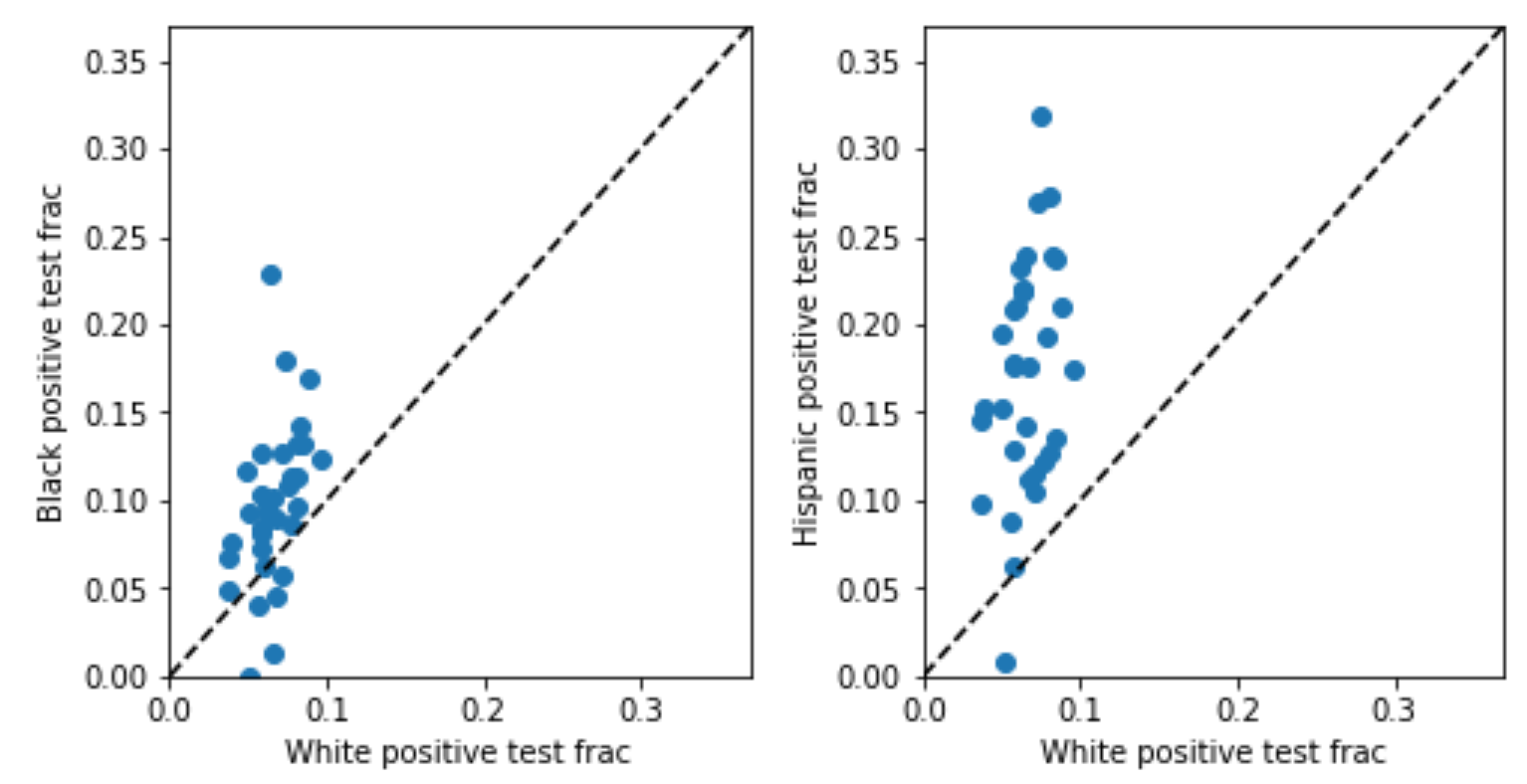
So, I went looking for a state with this data, and ended up with…Indiana. Why Indiana? Because it’s alphabetically third on the list of the six states that, according to the COVID Tracking Project, reports both tests and cases broken down by race, and the first two states didn’t have the data I needed [2,3]. In Indiana data, the Black and Hispanic positivity rates are indeed higher. In the plot below, each point represents one county; the horizontal axis plots the positivity rate for whites, and the vertical axis for minorities (Black on the left, Hispanic on the right). The dotted line would indicate equal testing thresholds for whites and minorities; the fact that points are generally above the dotted line shows that minorities generally have higher positivity rates than whites in the same county.
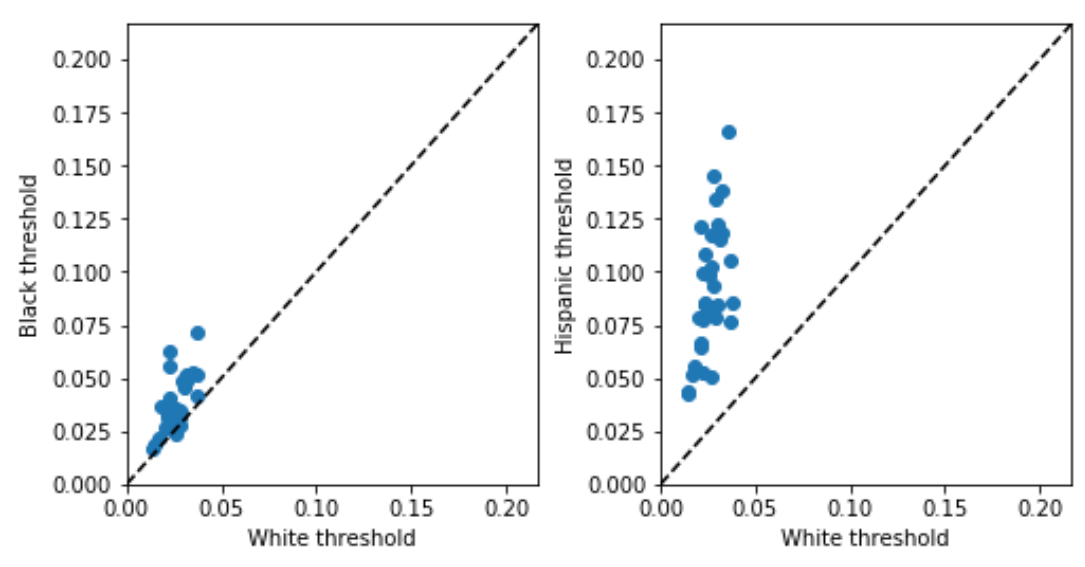
This suggests potential under-testing for minorities, but, as discussed above, might be misleading due to the problem of infra-marginality. The threshold test is designed to deal with infra-marginality, so what happens when we apply it? The inferred thresholds (plotted below) tell a similar story: thresholds for minorities are generally higher than those for whites in the same county. Both analyses, in other words, point in the same direction here, suggesting that minorities are under-tested, but the threshold test is robust to infra-marginality [4].
I think the idea of inferring the threshold at which people are tested, rather than just using the positivity rate, has broader potential applications. You don’t just have to look at racial disparities in COVID testing - you can try to assess under-testing across locations, or across other demographic dimensions like age. Threshold tests also potentially offer a principled way to combine the positivity rate and the number of tests/cases per capita to infer the true fraction of the population which is infected (which can be derived from the risk distribution which the threshold test also infers) [5]. Finally, COVID isn’t the only medical problem where we’re interested in assessing under-testing, and so we could potentially use similar techniques in other medical settings as well. I am neither a doctor nor an epidemiologist, so I thought I’d just put these ideas out there in case they’re helpful to others – shoot me an email (emmap1@cs.stanford.edu) if you have comments or ideas for future work.
Many thanks to Serina Chang, Sam Corbett-Davies, Pang Wei Koh, Lester Mackey, Nat Roth, Leah Pierson, Miriam Pierson, Jacob Steinhardt, and seminar attendees for helpful conversations, and to Jaline Gerardin, Alexis Madrigal, and Albert Sun for responding to my data requests. All code for this project is online here.
Methodological notes:
-
The generative model for COVID testing is:
- On each day, the probability \(p\) that a person of race \(r\) in county \(c\) has COVID is drawn from a race and county-specific risk distribution – a probability distribution on \([0, 1]\).
- Each person gets tested if their probability of having COVID exceeds a race and county-specific testing threshold, \(t_{rc} \in [0, 1]\). So the proportion of people who will get tested, \(f_{rc}\), is the proportion of the risk distribution that lies above the threshold. The proportion of tests which will be positive, \(g_{rc}\), is \(E[p \mid p>t_{rc}]\): that is, the expected value of the risk distribution conditional on being above the testing threshold.
- To generate the observed data, we draw \(tests_{rc} \sim \text{Poisson}(n_{rc} \cdot f_{rc})\), where \(n_{rc}\) is the population for race \(r\) in county \(c\). We draw the number of cases (positive tests) from \(\text{Binomial}(tests_{rc}\), \(g_{rc})\).
Then you have to make a bunch of decisions about how to parameterize the risk distributions, the priors you place on parameters, and so on - probably the most succinct comprehensive description is my Stan implementation.
Things I’m still uncertain about - I’m not totally sure about the Poisson (the original test just uses binomials) - I favored it for two reasons. I didn’t think a binomial made sense because the number of tests could in theory exceed the population, which a binomial doesn’t allow for. And a Poisson is nice in that the sum of Poissons is also a Poisson, so we can think about thresholding the daily probabilities of someone being sick (which makes sense to me as a generative model) and still fit a model to the cumulative data using a Poisson, and cumulative data is all we have. A downside of a Poisson is that it doesn’t account for overdispersion, so I welcome other modeling suggestions. I tried fitting another model using a binomial rather than a Poisson, and saw similar results. (Another model I initially considered and rejected was a population model we developed for NYC stop-and-frisk data. I didn’t think that model was a great fit here because it doesn’t make use of the total population of each county, just the fraction of the county which is of each race, which seems like important information.) ↩
-
Delaware tracks the data (in a very nice website!) but censors it pretty aggressively for privacy reasons, creating a nasty form of statistical bias called censoring on the dependent variable; I got no reply from the Delaware government when I asked for non-censored data. Illinois does not make the necessary data publicly available. ↩
-
Indiana data also has caveats. It has significant missing data: the median county has ethnicity data for only about half of cases and tests, and race data for 80-90% of cases and tests. Indiana is also very white, so I filtered for counties that had large enough minority populations to be able to meaningfully assess disparities: they had to have Black and Hispanic populations of at least 500. This retained counties containing 87% of the Hispanic population and 98% of the Black population. (You can fit the model without applying this filter - it converges, and still shows the disparities in thresholds, but it doesn’t fit the data very well, I think because there are a lot of outlier counties with tiny minority populations. There may be a way to deal with this by playing with the model parameterization.)
Another drawback of Indiana data is that it reports data aggregated by race, and data aggregated by ethnicity, but not data aggregated by both at once. So to fit the model on white, Black, and Hispanic populations simultaneously, I had to make assumptions about how the two sets of aggregate counts should be combined. As a sensitivity analysis, I tried doing this three different ways I thought were reasonable (I came up with two, and my boyfriend came up with one), and all yielded the same conclusion. ↩
-
It’s worth noting that, when the two analyses differ, understanding why they’re different can be interesting - that’s beyond the scope of this post, but for more discussion, see the original threshold test paper, Section 3.4. ↩
-
This may require data on daily cases, as opposed to cumulative cases. ↩